There’s no way around it: all charities need a website that helps source new traffic and converts these same visitors into loyal and returning donors.
This article guides charities through the various digital puzzle pieces that fit together to create an engaging visitor experience on your website – one that harnesses UI/UX best practices to drive conversions.
As your organization builds out more of your website and webpage architecture, these tips and tricks will teach you how to construct an optimized and frictionless donation page – also known as a ‘Ways to Give’ page.
Small changes, from anchoring your donate button in the top-right corner, to simply offering multiple giving options, can impact on your conversion rates and grow your overall fundraising revenue – ready to learn more? Let’s dig in.
Download our guidebook for actionable strategies and fundraising insights.Get Expert Insights on Fundraising
Tips for Charities With a Landing Page Only
If your organization operates with a landing page as your only website architecture, these best practices still apply towards optimizing your digital experience, communicating professionalism, and making taking action — such as donating or volunteering — easy and smooth.
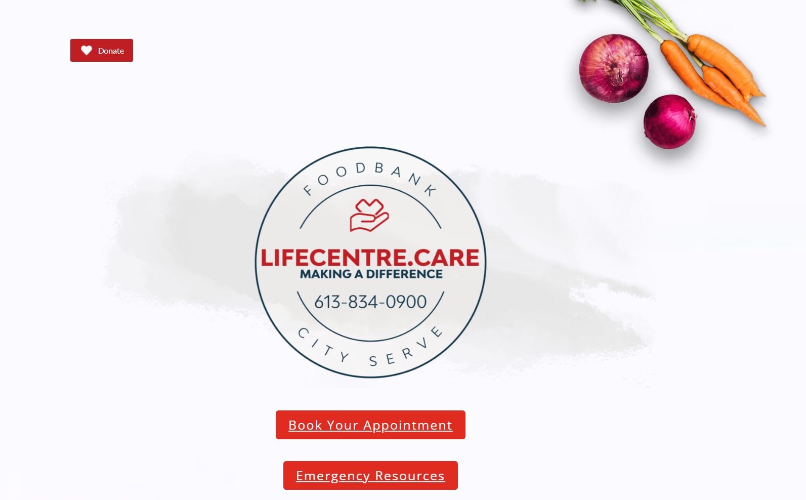
Check out Lifecentre Food Bank – a robust example of a charity operating with a landing page as a website.
What Drives Online Engagement?
One of the key characteristics of an engaging charity website is that it should be easy for donors to make a donation from any point within your website architecture.
Best practices are that visitors should never be more than 2-3 clicks away from your giving portal – also known as your ‘Ways to Give Page’. To achieve this, install an anchored navigation bar with a donate button in the top right-hand corner.
This website structure makes donating accessible from each of your webpages, and maintains fundraising access as users scroll down.
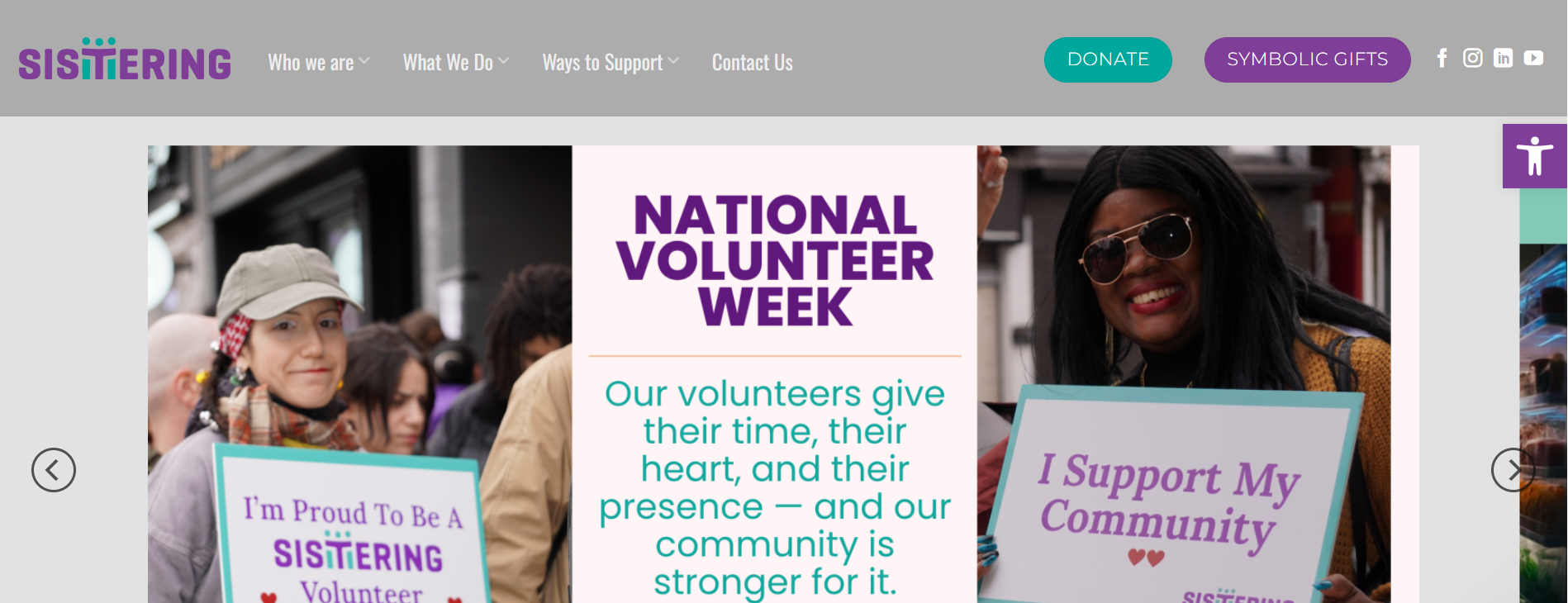
See Sistering’s accessible navigation bar and donate button.
Text & Copy Website Checklist:
Is the text and copy on your website?
- Clear
- Easy to understand
- Scannable
- Icons
Are you using the correct headline and hierarchy structure?
- One H1 heading per page
- H2/H3 subheadings
- Bulleted lists
Website Navigation Checklist:
Seamless user flow
- Is there a maze of links or click-throughs?
- Is the user ‘working hard’ to find pages or components?
Fast loading speeds
Call-to-Actions (CTA)
- Are they prominently placed?
- Is there one on each page?
Responsive design (adapts to different screen sizes)
- Desktop
- Mobile (in today’s climate, mobile accounts for close to 50% of all website traffic and cannot be ignored)
Design Element Checklist
Websites require a consistent ‘look and feel’. You create this ‘vibe’ by aligning the following brand elements. Run through this checklist, and ensure these brand elements are applied consistently throughout your site:
- Logos and symbols
- Colour scheme
- Typography and fonts
- Graphic or visual illustration style
- Images and/or photography style (if relevant)
- Personality and voice
Webpage Search Engine Optimization
The items in this checklist allow you to optimize your website for search engines, maximizing the amount of organic traffic you bring in.
Website Search Engine Optimization (SEO) Checklist:
- Headlines feature key words to boost visibility and relevance
- Internal backlinks to connect readers to other places on your site
- Broken and/or dead links are removed
- “Last edited” timestamps are updated to show your content is regularly maintained
Structure Your Website Keywords Around Four Themes:
Your mission and goals
- ‘Food bank’, ‘women’s shelter’, ‘local theatre’
Your audiences
- Touch on different streams and intentions
- Donors, first-time visitors, volunteers, corporate partners, media
Your location or region
- Most searches are location-based
- ‘Food drives Toronto’, ‘where to donate clothes in Ottawa’ or ‘community garden organizations Calgary’
Topic-related questions focused on what charities do/who they serve
- Search your charity’s name or cause on Google, scroll down to the ‘people also ask’ section and see which questions appear.
Combinations of these four themes comprise the most common search terms for your cause. Integrate popular keyword terms into your website copy, especially on important real estate like headlines. This optimizes your website for search engines, helping your organization get seen and acquire new traffic.
Pro tip: search your charity’s name or cause on Google, scroll down to the ‘people also ask’ section and see which questions come up.
How to Leverage Your Website to Fundraise
Online fundraising campaigns can be ‘made or broken’ simply by the design of your donation page — also known as your ‘ways to give’ page. In this chapter, we walk through easy optimization techniques to maximize the fundraising page of your website. Implementing these practices increase the chance that donors and first-time visitors will give to your cause.
How to Structure Your Ways to Give Page
Your ‘Ways to Give’ page is the central fundraising hub on your website. This page should feature multiple options for giving to your charity. This way, donors can make a donation through the pathway of their choice, including non-monetary forms of giving to increase inclusivity.
Offer Donors the Following Giving Options:
One-time donations
- For best results, use pre-set giving amounts ($50, $100, $150 etc)
- Turn on the preset option for donors to cover the cost of the transaction fee
Monthly donations
-
- Set monthly giving on your donation form as the default giving method
- Monthly giving provides charities with more predictable revenue streams, helping plan and budget in the long term
Tribute gifts
Securities gifting
In kind donations
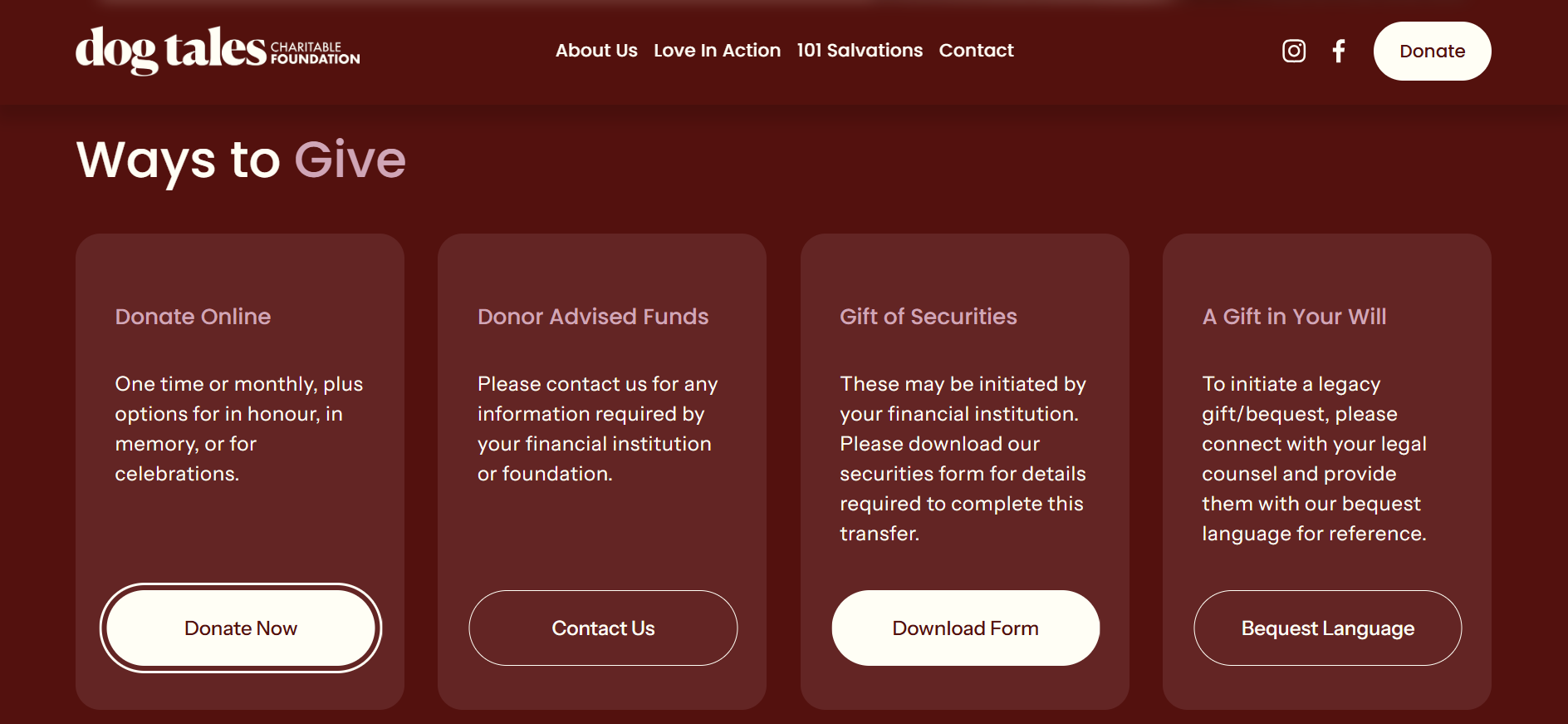
Example of a robust ‘ways to give’ page from Dog Tales Foundation
Offer Donors Embedded Giving
Best practices for fundraising instruct charities to offer donors ‘Embedded Giving’ – also known as a way to make donations without leaving your ways to give page. By embedding your CanadaHelps donation form directly within your donation page, you create a seamless giving flow for donors.
Pro tip: offering embedded giving can increase your conversion rate. Each time donors have to navigate away from the page they are on, in order to make a donation, it adds unnecessary friction to their transaction flow, which increases your abandoned cart rate.
Think of each additional step in your checkout process as a ‘friction point’ where donors have the potential to get distracted, and fail to complete their transaction. By offering a single-page donation process, embedded giving increases your conversion rate and lowers the likelihood that the donor will abandon their cart during the transaction.
Embedded giving makes donating seamless – best practices recommend that charities do not:
- House donation forms on a third-party site
- Use an external link
- Instruct donors to give through bank transfer and/or Interac eTransfer
- Require donors to download a form
- Offer only methods for in-person/mail-in donations
Ways to Give Page Optimization Checklist:
- Uses action-oriented language
- Features prominent Calls-To-Actions (CTAs)
- Offers multiple streams of giving
- One-time
- Monthly
- Securities and mutual fund donations
- Non-monetary ways to give (volunteering, in-kind donations, etc)
- Address and mail information for direct-mail donations
- Features a donation hierarchy
- Preferred modes of giving are placed first, and higher up, on the page
- Expensive and/or slow modes of giving (Interac e-transfer, direct mail, etc.) are placed last, and in lower spots on the page.
Pro tip: once you optimize your Ways to Give page, here is a checklist of guidelines you can return to periodically to assess your donation page.
Maximize Fundraising with CanadaHelps Donation Forms
CanadaHelps charities can set up an unlimited number of donation forms. Each form is designed in a matter of minutes and the setup does not require complex technical knowledge, coding, or design skills.
Offering donors multiple forms gives charities the ability to tailor donation forms to specific campaigns, and prioritize many types of forms that cater to different audiences.
Most importantly, charities with 2+ active donation forms earn 2.5x more annual revenue than charities using a single donation form.
Donation Form Placement Checklist:
- Place near the top of your donation page
- Traffic does not have to scroll down the page to find the form
- Offer multiple donation form types
Apply Custom Branding
Donors are more likely to give to your cause when you apply the unique brand elements of your charity onto your CanadaHelps donation form. Match your donation form to your website’s aesthetic or brand guidelines — to align with the consistency design principle.
Donation Form Customization Checklist:
- Upload your organization’s unique logo
- Input your brand colour palette
- Personalize your thank-you message
- Turn on ‘cover the fees’
- Turn on smart sums
- Prompt donors to convert their one-time donation into a monthly donation
- Create multiple active donation forms
- Have you made a Securities form?
- Have you created a multi-step form?
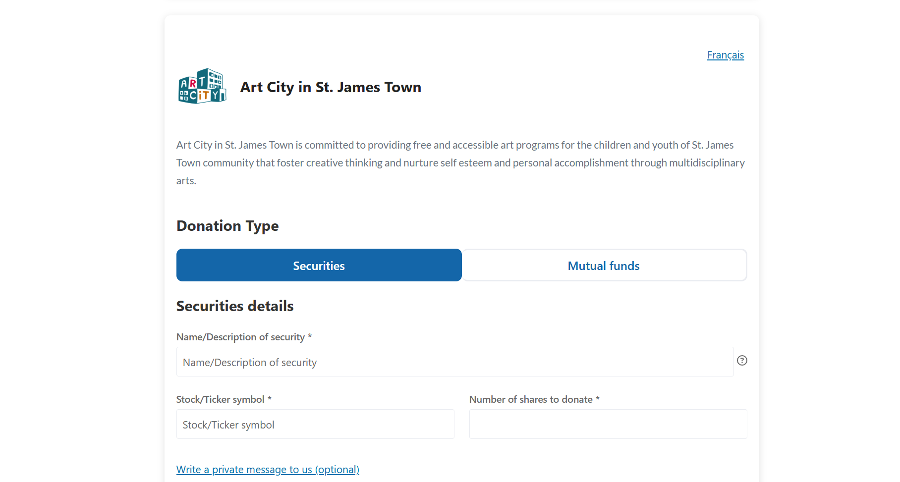
Canadahelps’ securities donation form on Art City Kids website
Put these Practices into Action
Crafting a high-conversion charity website doesn’t happen by accident – it’s the result of many intentional design choices. From writing SEO-optimized copy, to offering donors multiple ways to make a gift, to creating a consistently branded ‘look and feel’ throughout – each different piece plays a part in driving engagement and, subsequently, giving.
As you integrate these web design best practices, remember to test the overall flow of your website architecture regularly to ensure that it functions smoothly and contains no broken or dead links.
Ready to learn more about website design best practices? Download Canadahelps free ebook for a complete, step-by-step guide to optimizing your charity website – it’s packed with strategic advice, user-friendly checklists, and real-world examples to help you get started.
Access our practical guidebook: Foundations Of Website Design For Charities.Looking to Level Up Your Fundraising Strategy?